A behind the scenes look at the set of Sketchland
By Gerald Strother, Producer
The number one thing you have to get right with a comedy show is the humour. If you don’t have a funny show then you haven’t made a comedy show. You’ve made a play. And plays are good. But not if you were asked to make a comedy show.
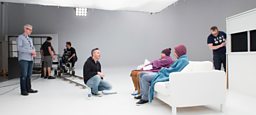
We were in a really fortunate position with . To have had the opportunity to make in 2014 and to have the chance to build and improve on a format was a privilege we took really seriously.
We looked at every element of the show and explored how we could develop it. We wanted to improve on everything. Of course, it starts and ends with the writing. We worked hard to make it funnier, the sketches shorter, more punchy and offer a variety of styles of comedy.
We have visual gags this time around, Lifehacks which are supposed to make your life easier but which would really just disappoint you if you tried them out, and we have some surreal stuff too.
But as well as the writing by our brilliant team of new, young, fresh voices, we were also incredibly keen to develop the visual elements of the show too. The design and sets are a huge part of the shows identity.
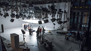
For example, the space we filmed in. We knew that to create more movement in this show and offer our two cameras more interesting shots and depth, we needed a bigger studio space.
Bigger spaces mean more lighting and more people need to be involved when you have a fully working studio, but the difference the decision made can be seen on screen.
-
![]()
We were able to space out design elements to give a larger feeling location, have space for graphics, and room for an actor to get up and leave from.
Design elements
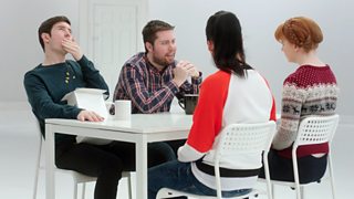
We loved how we used black and white design last time around but this time wanted a more contemporary look – newer-looking furniture, more distinctive lines and symmetry, cleaner whites and blacks – so that the graphic inspiration was really visible and the colour which came from the costumes and actors really punched through.
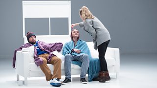
It’s amazing how little you actually need to define a location, if you get the main elements right.
We took it as a challenge to see how stripped-back we could make the set.
We tended to start with three essential pieces of furniture to set the location and then worked out what we might add to build character and ensure that it didn’t look the same as the space from the sketch which ran before it.
It’s a very theatrical way to work and it really helped define how the show looked.
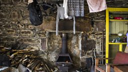
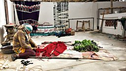
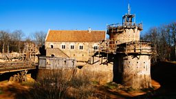
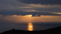
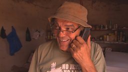
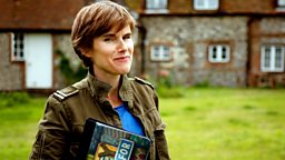
But of course, it’s not all black and white. As demonstrates – a bit of colour in between our boldly stylised studio work, really helps to expand our sketchland.
